By Charlotte Lowrie
What makes one or two photos rise to the top in a stack of 20, 30, or even 100 photos? The answer, despite what beginning photographers may imagine, is not a secret known only to seasoned photographers and photo editors. Nor is there a single element that makes a photo "good." Rather there is a not-so-secret checklist of criteria commonly used to evaluate images.
Having said this, I hasten to add that evaluation checklists vary by person, and, like other judging criteria, there are always exceptions to the rules. Furthermore, the lines separating the criteria very often blur. Photography is, after all, subjective.
Despite these disclaimers, knowing the commonly accepted evaluation criteria can give you a roadmap to getting better day-to-day photos, and a guide for evaluating the final images. Following is the evaluation list that I use when I review my images. In addition, I've included sample questions for each checkpoint that you can use or adapt for evaluating your photos.
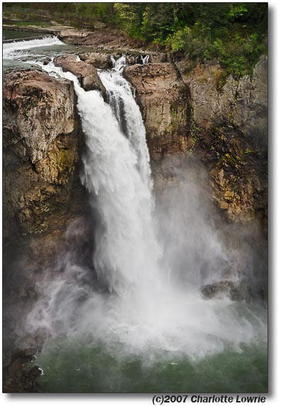 1. Is there a clear subject or point of interest? In a strong photo, the viewer can immediately identify the subject. While this sounds like a no-brainer, a surprisingly high number of photos fail to clearly identify the main subject. Instead, a complex montage of elements compete for the viewer's attention.
In a strong photo, the subject should dominate the image and form the viewer's first impression. If the subject is strong, the viewer's eyes may move to explore other areas of the image, but the eye is inevitably drawn back to the subject. While the colors and cloud formations of a sunset are dramatic, they are seldom enough to create a compelling image. Beyond a quick, though perhaps appreciative first glance, most sunset photos are quickly forgotten. And in large numbers, they quicky become "ho-hummers."
However, when the photographer adds a foreground element that gives the environmental context and interest, you then have a sunset photo with impact, and one that is far more likely to capture and retain the viewer's interest.
To evaluate your own photos for a strong center of interest, try asking yourself these questions. Or show the picture to a friend and ask your friend to honestly answer the questions.
- When you look at the photo, what is the first thing you see? If you're evaluating your own image, is what you notice first in the image the subject you had in mind for the photograph?
- What holds your eye the longest?
- Do other elements in the image compete with the subject for attention?
- Do technical aspects such as light and the direction of light, depth of field, focus, and so on add to or detract from the subject?
 2. Is the image composition pleasing? In a strong photo, there should be a strong and pleasing sense of overall organization and flow. While entire books are written on composition, at the most basic level, composition is the process of establishing a sense of order for the elements within an image.
Note: Composition rules or guidelines are a helpful starting point, but they are useful only as long as they enhance the overall scene or subject.
Here are some basic composition pointers.
- Fill the frame. Filling the frame helps establish the center of interest, and, simultaneously, it helps exclude competing background details. You can fill the frame by moving closer to the subject or by using a longer focal length (or zooming in).
- Organize elements. In composition, the Rule of Thirds is often used to organize elements in a composition. This rule is derived from the Golden Section or Golden Rectangle that divides a space, such as a photographic frame, into equal segments to create pleasing proportions. In simple terms, if you apply the Rule of Thirds in photography you simply imagine a tick-tac-toe pattern on the viewfinder. Then, when you place the subject of the photo at one of the intersection points, the result is a pleasing sense of order.
- Control the background. A non-distracting background is a compositional tool to help keep the viewer's eye on the subject of the photo. You can avoid background distractions by moving your position or moving the subject and by using a wider aperture (smaller f-stop number) to blur the background. As you look through the viewfinder, examine the entire scene and shoot with as few distracting background elements as possible.
- Keep it simple. The fewer the elements in a photo, the stronger the statement the image makes. Simplicity also helps prevent the viewer's eye from being distracted. To evaluate the composition of your images, try asking these questions.
- Is there a sense of order and balance in the image that helps lead the eye through the composition?
- Are elements included that do not contribute to the subject of the image?
- Are elements excluded that you could include to enhance the subject?
- Do the depth of field, focal length (lens or zoom setting), lighting, angle, and perspective enhance the composition?
- Does the framing enhance the composition?
 3. Do the focus and exposure settings enhance the subject or scene? With the exception of photos that either intentionally show motion or are taken as soft-focus images, tack-sharp focus is one of the first things that everyone notices first about an image. Just remember that the point of sharp focus is where the viewer's eye goes first in the image.
Note: In my experience, the best way to ensure tack-sharp focus is by manually selecting a single autofocus point that is on top of the point in the scene or subject that should have sharp focus. When you let the camera automatically select the autofocus points, the camera may or may not accurately guess what the subject of the image is. You'll have sharp focus somewhere in the scene or subject, but it may not be where it should be. In a portrait, chances are excellent that the camera will focus on the nose or teeth rather than on the eyes.
If the picture is of a person or animal or bird, the focus should be on the person's eyes. For a flower, the center of the flower should, in most cases, have the sharp focus. For a landscape, hyperfocal distance focusing is a good option to maximize depth of field in the scene.
The exposure--the combination of aperture, shutter speed, and ISO--should also enhance your vision for the photo. For example, in a scene of an old building, does the exposure emphasize the age of the structure and perhaps the starkness of the surroundings? To create this sense, a photographer can set a narrow aperture (larger f-stop number), and perhaps convert the image to black-and-white or sepia during image editing.
On the other hand, if the image is a portrait of a person, the exposure settings will be quite different. For example, the classic approach is to use a wide aperture (small f-stop number) to create a shallow depth of field. The shallow depth of field helps blur the background while bringing the subject visually forward in the image. (Of course, a photographer might choose the opposite setting to achieve an entirely different look.) The question is whether the exposure settings were used to enhance the subject.
Questions that can help you evaluate whether focus and exposure settings are appropriate for an image include:
- Does the depth of field enhance the subject, mood, or look of the image or does it distract from it?
- Does the focal length enhance the subject and message?
- Does the image have good overall contrast for the type image the photographer intended?
- Does the color appear natural and/or does it help set the mood of the image?
- If the image is in color, would it be stronger in in black and white, or vice versa?
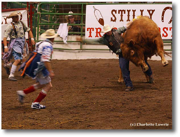 4. Does the photo tell a story. Most often, the difference between a photo you remember and one that you quickly forget depends on whether the photo tells a story. As a viewer, I want to see the story, and this is one of the most important evaluation points that I look for in other photographer's images. It is also the element that I try to include in my images.
In strong photos, the story is revealed at first glance, and it is self-contained. In the best images, the story evokes an emotional response from the viewer. I believe it's that emotional response that ultimately makes the image memorable. Try asking these questions as you evaluate images to decide if the image tells a story.
- At a minimum, does the photo make a statement that you can articulate?
- Does the photo elicit an emotion? In other words, can you relate to the subject or the situation?
- What could be changed in the image to give it a stronger story or message.
5. Does the lighting enhance the subject and message? Like the composition, lighting is a subject that is worthy of book-length discussions. Whether in shooting or evaluating photos, light should be used to its maximum potential to reveal what's important in the image and to set the overall tone of the photo.
In masterful hands, lighting is used selectively to focus attention on specific areas of the subject while simultaneously demphasizing less important areas; to guide leading the eye through the composition, and to establish the overall mood and tone of the image by taking advantage of the different temperatures (colors) of light.
Light is another "design tool" that can be used to enhance the overall mood and intent of the image and subject. For example, when taking a portrait of a man, a strong, unfiltered white side light may be appropriate because it emphasizes the man's rugged and angular features. On the other hand, a soft, warm-color diffused light is more appropriate for a portrait of a woman because it mirrors the delicate features of these subjects. And, of course, there are few photographers who fail to take advantage of the superb colors of light during sunrises and sunsets.
When evaluating the lighting merits of a photo, ask:
- Is the intensity and color of light appropriate for the subject?
- Is the light too harsh, too contrasty, or is it too soft and too flat?
- Are all important aspects of the subject well lit, or could the lighting be improved by using a flash, fill flash, reflector, or auxiliary light?
- Does the light help convey or enhance the overall message of the photo?
- In a color photo, is the color balanced or corrected for the light temperature (in other words, the overall color should be natural-looking).
 6. Is the approach creative? In broad terms, I define "creative" as an image that goes beyond predictable techniques and treatments. In more specific terms, the best creative images show subjects through the photographers' eyes and perspective. In other words, the photographer reveals the subject in extraordinary ways; ways that the viewer otherwise would not have seen.
Creative techniques and subjects can range from bringing abstract ideas into a visual form, taking a concrete idea and making it abstract, relating or associating unrelated concepts into a visual space, or, in short, taking a fresh look at and lending the photographer's unique thinking and vision any subject.
When evaluating the creativity of a photo, ask yourself:
- Does the photo reveal more about the subject, or show it in unexpected ways?
- Does the photo relate visual elements in unusual and intriguing ways?
- Is the photo interesting and fresh, or is it just too weird for words?
Depending on the day, and depending on the photo, I may add other criteria to my evaluation checklist, but I seldom delete one of these basic six points.
In the real world, I also know that if 10 people look at the same photo, approximately five may give it good marks and five may give it low marks. Photography is, of course, as subjective as individual taste.
But when everyone has had their say, the bottom line is that you now have evaluation criteria so that you can evaluate your own work. If an image is your best so far, enjoy the image and your achievement. Then go back in a month or two and evaluate the image against the six basic criteria again. If it still passes the test, frame it and hang it on the wall, and then go out and make your next best picture.
Related articles:
Related online courses: